

The last time I mentioned charts, I speculated that the relatively poor performance the overall market had in 2015 was likely to continue in 2016. The first three trading weeks have done little to dissuade that thinking, although it is not a certainty that we are in a full fledged bear market. There is still something for the bulls to hang their hat on, but it is still grim reading. Continue reading “Chart Talk – 23 Jan 2016”
The Second Half

Last Wednesday, the Federal Reserve did what it had been signalling to do for months – raise interest rates by 0.25%. In answering a question about the significance of the move, made 7 years after the onset of the most expansionary regime in the history of central banks, Chairwoman Yellen said the following:
…The first thing that Americans should realize is that the Fed’s decision today reflects our confidence in the U.S. economy, that we believe we have seen substantial improvement in labor market conditions, and while things may be uneven across regions of the country and different industrial sectors, we see an economy that is on a path of sustainable improvement. So, in thinking about their labor market prospects and their financial prospects going forward, I hope they will take this decision as one that signals the FOMC’s confidence that conditions will continue to strengthen and job market prospects will be good. It is a very small move.
The game of central bank management of interest rates, and thus ecnomic activity is largely a game of two halves. The first half involves arbitrarily reducing rates so as to stimulate economic activity. The second half involves a Jenga-like attempt to reverse the stimulative impetus without reversing the resultant economic activity.
Unfortunately, central banks have never been able to avoid the fact that what they giveth must be taketh away, unless they want to sacrifice the currency in their control to continue to support the economic expansion they created. The bottom line is that central bank-created recoveries are inherently unstable, prone to bubble formation which only ends in a crash.
Of course, the central bankers, and those who espouse the theoretical playbook they work from, do not see things this way. They see the Fed as mere stewards of the economy, playing a benevolent role in fostering growth, only really injecting itself when the economy gets ‘off track.’ Once back on track, the Fed can move back into the background, in the same way training wheels can be removed once one learns to balance oneself on a bicycle.
Hence, Yellen’s comments last Wednesday were a declaration of confidence that the economy can balance on its own, and the training wheels are no longer needed. The data points, however, argue otherwise:
Here are a few charts depicting the issues forming in many leading indicators.
Manufacturing
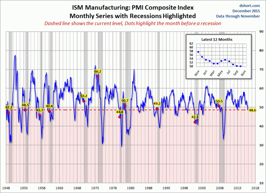
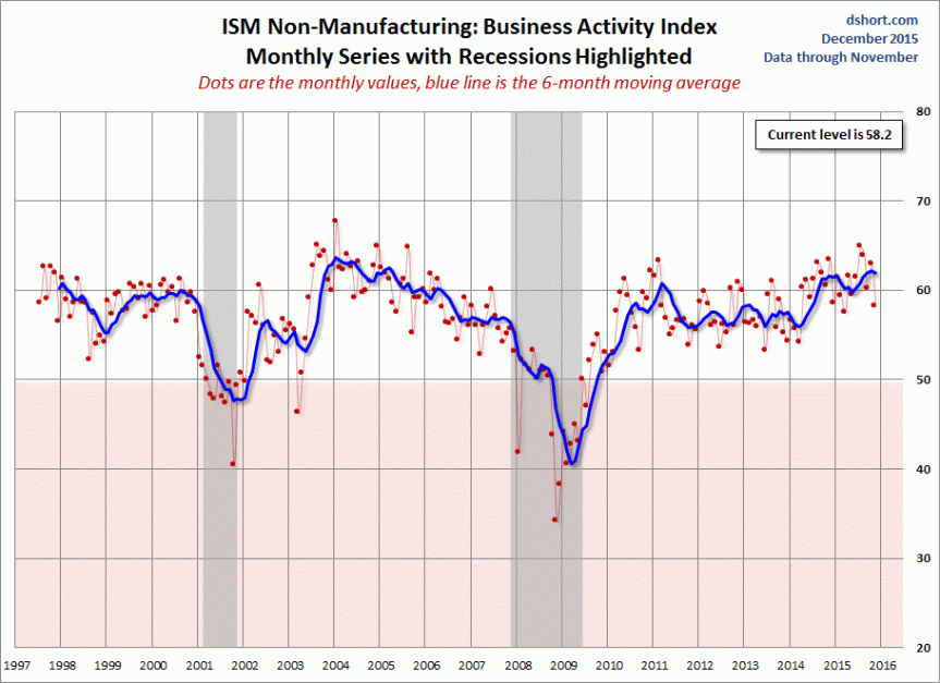
The broadest measures of production data, both manufacturing and non manufacturing data have turned lower. Manufacturing data in particular is a red flag, as it has dipped into contraction territory for the first time since 2012 and is at the lowest level since the depths of the recession.
Sales Data
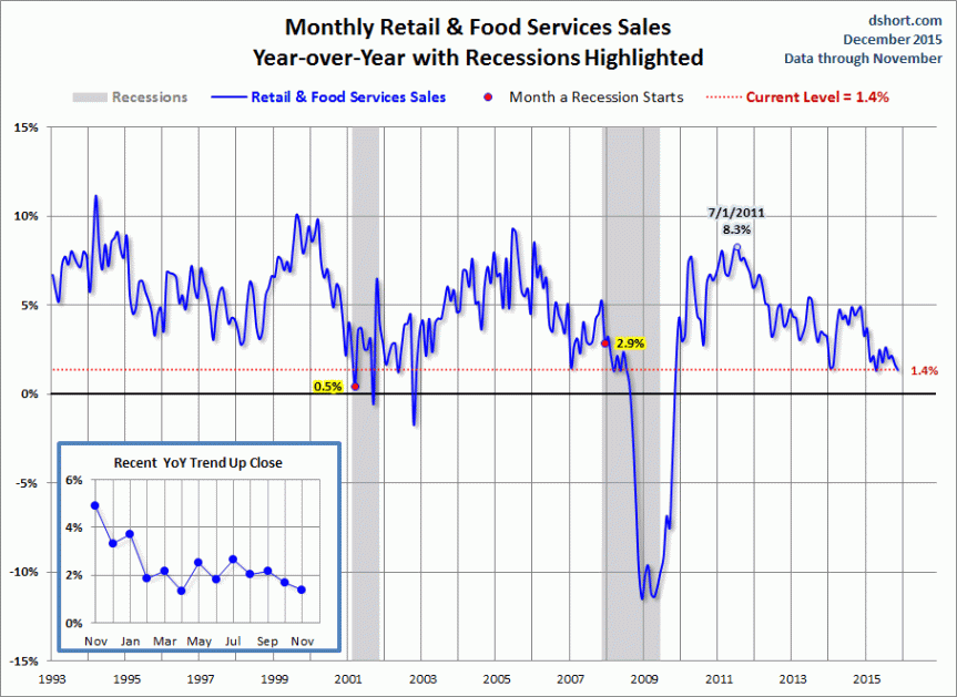
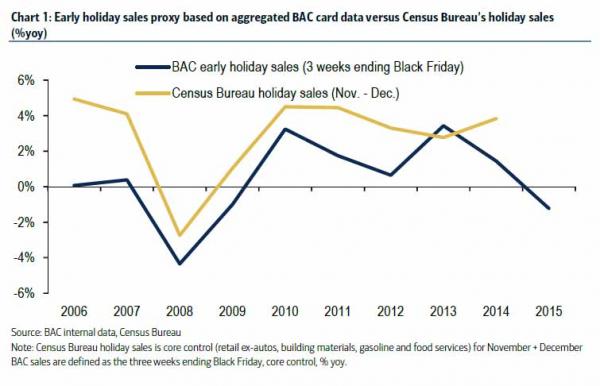
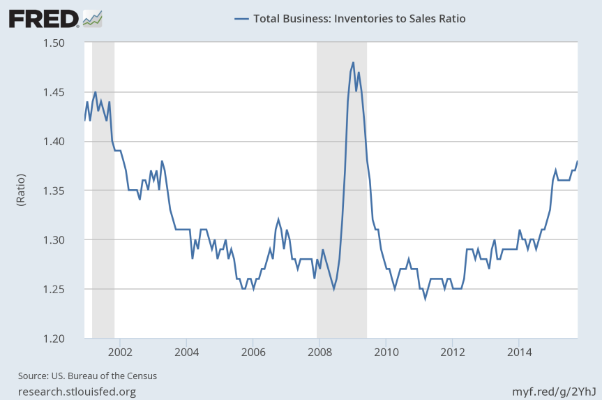
The first chart shows retail sales in general. The second chart is a more focused look at Holiday spending, as tracked by Bank of America. While the shopping season hasn’t completely finished, it has gotten off to a poor start. The inventory to sales ratio shown in the final chart is indicative of producers stocking up on goods in prior years that consumers cannot afford at current prices. This ratio is at Great Recession levels which does not portend well for prices and spending going forward.
Housing
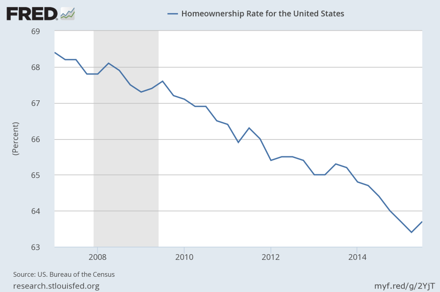
Home prices, permits and starts have rebounded in the recovery, although they sit at roughly 20% lower than the housing boom peak. This fact, combined with the falling home ownership rate depicted, indicate that the problems with the housing market were never properly addressed. The truth is that prices are still too high and the average worker cannot afford to own a home.
Employment
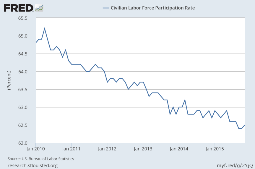
As with housing, the positive development in the headline unemployment rate masks the nature of the labor force. Charts such as the labor participation rate, which shows it is at a level not seen for 40 years, belie the headline figures.
Despite working from a faulty playbook, the Fed isn’t blind to these developments in the US economy. They are, however, beholden to that playbook. At some stage they had to raise rates to prove they could do it. Yet the same Keynesian theory which validates the Fed in its role as economic steward, and as such requires it to bow out at some pint, also would put forth that the economic conditions are nowhere near good enough to warrant a raise.
The Fed had telegraphed a rate hike for the majority of the last 12 months, and it is my feeling that they simply couldn’t postpone one any further without causing concern. Not raising would have alerted people that the economy wasn’t as good as advertised, and resulted in a wide scale recalculation of growth prospects.
Given that the reality is the economy really isn’t as good as advertised, I suspect that the only way to raise rates in the face of that was to do what Yellen did – raise and accompany that with a full forced exaltation of the economy and its prospects. Yellen’s continued mentions of how confident the FOMC is that everything will be just dandy is perhaps the latest in the Fed’s attempts to manage policy via signalling. If they say it, it will be true – at least they hope so.
I’m more skeptical. The economic recovery that the Fed engineered was much more pronounced in asset prices than anywhere else. Indeed, many commentators speculate that the Fed indeed uses the fluctuations of indices such as the S&P 500 to gauge the effectiveness of its policy.
The persistence of stocks near all time highs, despite the turbulence of the last 18 months perhaps gave the Fed the license to raise rates last week, as telegraphing it was going to do this for months wasn’t enough to cause a material decline in stock prices.
This buttressing of the recovery via asset price inflation may have been dealt a terminal blow with the start of official normalization of rates. The early tremors of relative tight policy since December 2013 have already been felt in the High Yield debt market. These ‘junk’ bonds have been in decline for over a year, kicked off by the decline in oil prices. The following chart is a chart of the Bank of America High Yield Index, a widely used metric.
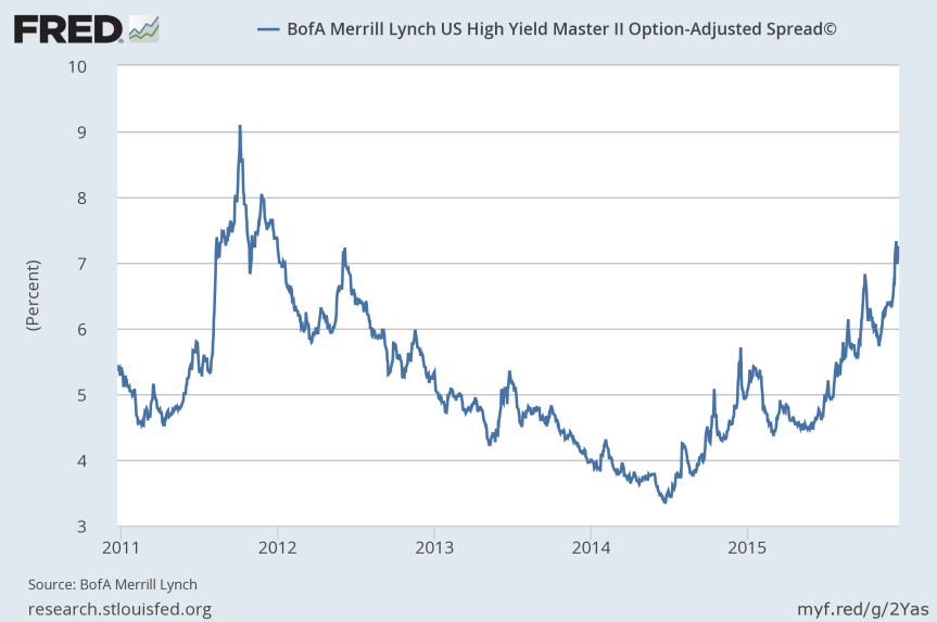
The chart is of percentages, which means that bond prices are inversely related. The 2014 low in yield are highs in bond prices, and as you can see, these prices have fallen steadily since. The following is a chart displaying the number of institutional investors in the leveraged loan market,
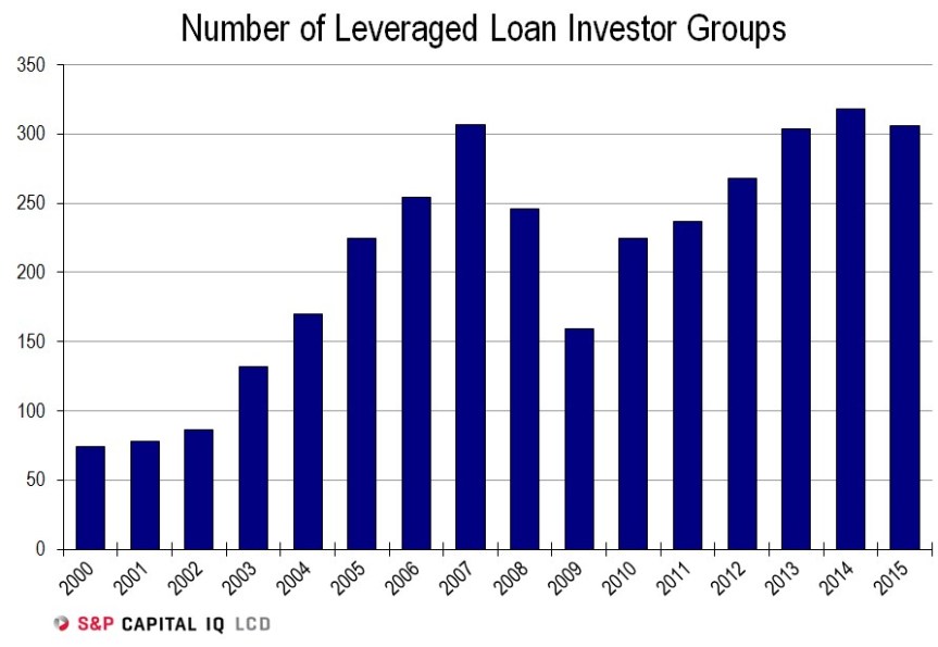
Two things stand out. The first is that the 2015 total has fallen compared to 2014, the first time there has been a drop since the depths of the Great Recession in 2009. Secondly, the high mark, in 2014, was set in the same year as junk bonds peaked in price. In other words, institutional investors piled in at exactly the wrong time, creating a class of buyers who potentially all need to sell, in a market that is continually trending lower.
As the Fed continues to normalize rates, the pressure on the junk market will only increase. The underlying prospects for the businesses which borrowed to invest at high prices, and institutional investors which got leveraged to speculate in the junk market at high prices will only deteriorate, as they are trying to chase gains in a world of slowing growth.
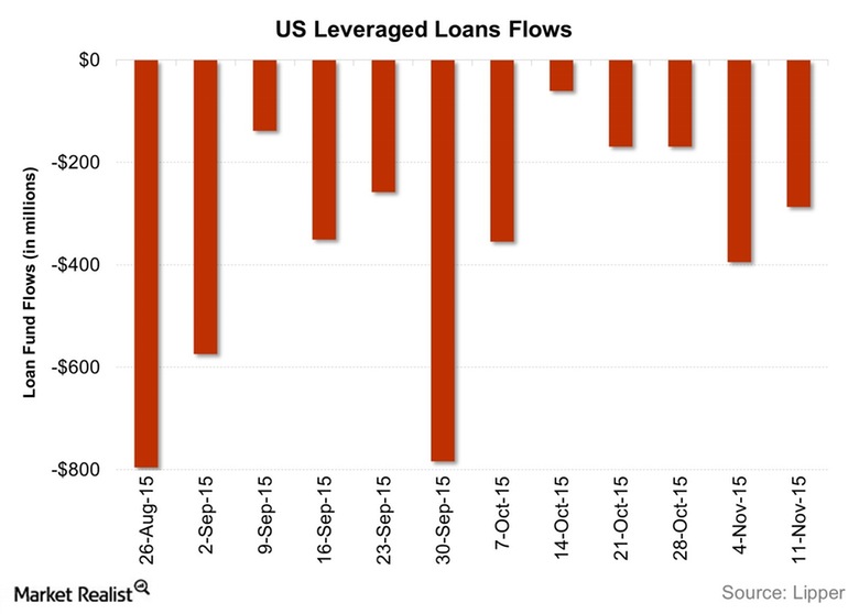
The depths to which the rot has gone is not known in full at this time, but it will be revealed as lending conditions continue to tighten. Falling bond prices put a strain on any derivatives which may exist, which in turn necessitate sales of other assets which are easier to sell (like stocks) to cover losses in less liquid markets. The following chart shows that these outflows have been consistent over much of the last quarter, which is in line with the spate of high profile hedge fund closings we’ve seen in recent months.
It is all very reminiscent of the subprime crisis of 2007. At that time, what seemed like a pedestrian issue in subprime mortgages suddenly became a systemic issue that threatened the financial health of the world.
Indeed, there are many similarities between the subprime crisis and the current junk bond tremors. They both were initiated by a proliferation of new debt creation, which drove money into a targeted market which was offering higher yields in an environment of depressed rates. As more money piled in, the prices for assets involved rose.
As the debt creation started to slow, the prices began to stall, and those who bought at elevated levels felt the pressure to sell. Selling beget more selling as levered players began to bail in droves. The systemic institutions which originally lent to the levered players were put under pressure by extension. The cascade of selling began to put institutions at risk, given the foundation of continued rising prices which once supported them was no longer present.
I’ve repeatedly pointed out, both here and under my former guise that in addition to the fate of the economy, the credulity of the Keynesian econoic theory is in the hands of the Federal Reserve and their management of the normalization phase of policy.
Many of the Keynesian persuasion proclaimed victory over the last few years, as the Fed looked to have resuscitate the US economy and restore growth. As I pointed out in detail in the past, these celebrations were ultimately celebrating at half time. The second half of the game that began with QE in 2008 has now begun in earnest.
The Fed must normalize rates with no hiccups, no economic meltdown, no outsized recession. Then, and only then can victory be declared.
A word on ‘broken clocks.’ There are many who accuse anti-Keynesians such as myself of being doom and gloomers, who are constantly bearish on the economy, such that these consistent predictions are worthless because a recession or financial crisis is inevitable anyway based on history.
There is some merit to that argument, but it is misplaced. Really the argument that those such as myself make is that there is a distinct chain of events that begins with Fed easing and ends in market crashes, which does more damage to the economy than the inevitable recessions we get normally. We merely would like to rid ourselves of a system which we believe to be extremely inefficient.
The Keynesians choose to ignore the existence of such a chain of events. Thus, if anti-Keynesians are broken clocks, Keynesians are clocks set 7 minutes fast. These clocks ‘work,’ as in the hands move, but the time told is never accurate. Which describes Keynesian theory perfectly.
Chart Talk – 9 Dec 2015
Yesterday, I spent some time discussing the general state of the US economy – specifically the issues it faces as the Federal Reserve seeks to transition into the rate normalization phase of its ‘Exit Strategy.’
This transition has been in the making for nearly two years, beginning with the Federal Reserve beginning to taper its asset purchases in December of 2013, continuing through the end of QE 3 in October 2014, and up to the presumed first rate hike in nearly a decade coming at the December 2015 FOMC meeting.
This has made for less than ideal trading conditions for much of 2015. The best you can say about it is that markets have moved sideways. More ominously, the world’s major stock indices all topped in the spring, with only the Nasdaq making a new high since that time.
Compared with the one way trading environment of the past 5 or 6 years, 2015 has been downright treacherous. It is no longer the case that one can blindly buy equities, wait for a few months or years and sell at a massive profit. This is evidenced by the trouble the hedge fund industry is experiencing, with many high profile funds returning customer money, or outright shutting down.
The following charts are longer term views of a few important markets, which may lend some insight as to where things stand at what I believe is a very important year to come in 2016. Continue reading “Chart Talk – 9 Dec 2015”
The Economic World According To Speculative Gains
As I write this, the Federal Reserve is about to embark on the first rate hiking cycle in a decade, the first since the Great Recession. In other words, it is officially initiating the exit plan which previous Fed Chairman Ben Bernanke laid out in this 2009 Wall Street Journal article. The Federal Reserve ‘entered,’ in the context of this piece, in 2008 with its decisions to slash interest rates to zero and to embark on the first of its Quantitative Easing programs. This was necessary, according to the mainstream interpretation of the Great Recession, because the patient that was the US economy found itself in the Emergency Room, needing to be saved.
At the risk of sounding inhumane, in this case the patient was not worth saving in my view. In fact, the patient/emergency room analogy to describe the current economic predicament isn’t entirely accurate. The reasons for that will be apparent by the end of this piece. Continue reading “The Economic World According To Speculative Gains”
